
The Story
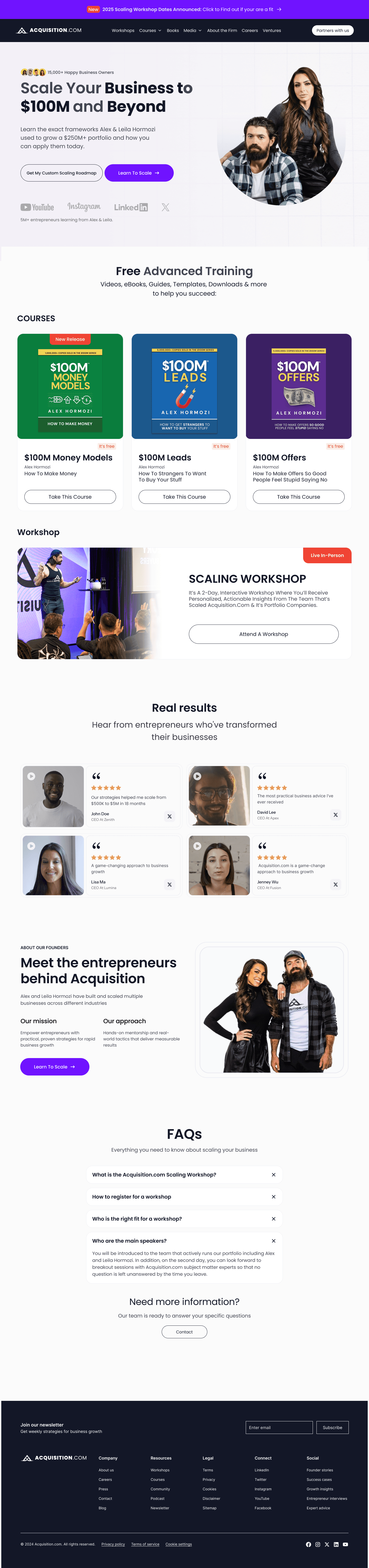
When I first looked at Acquisition.com’s homepage, I was surprised.
A brand doing $250M+ in revenue… but the website didn’t look or feel like it.
The layout was heavy.
The story wasn’t clear.
And the hero section had zero emotion — no trust, no direction.
This was a brand built by Alex and Leila Hormozi, who teach millions of founders how to scale.
But their homepage wasn’t doing the same for them.
So I decided to rebuild it from the ground up.
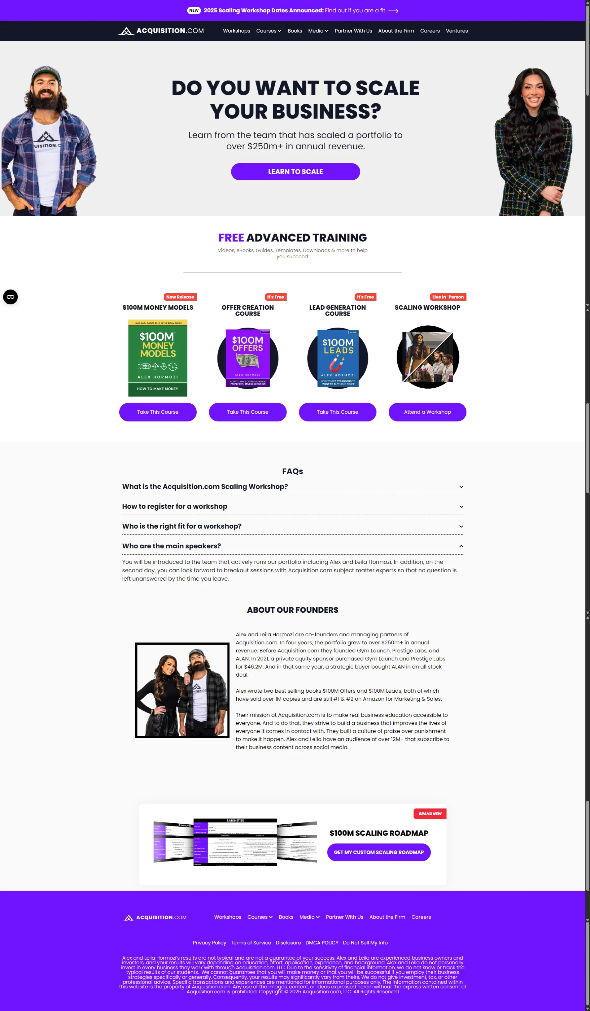
“The old homepage flat, noisy, and unclear.”
What Changed
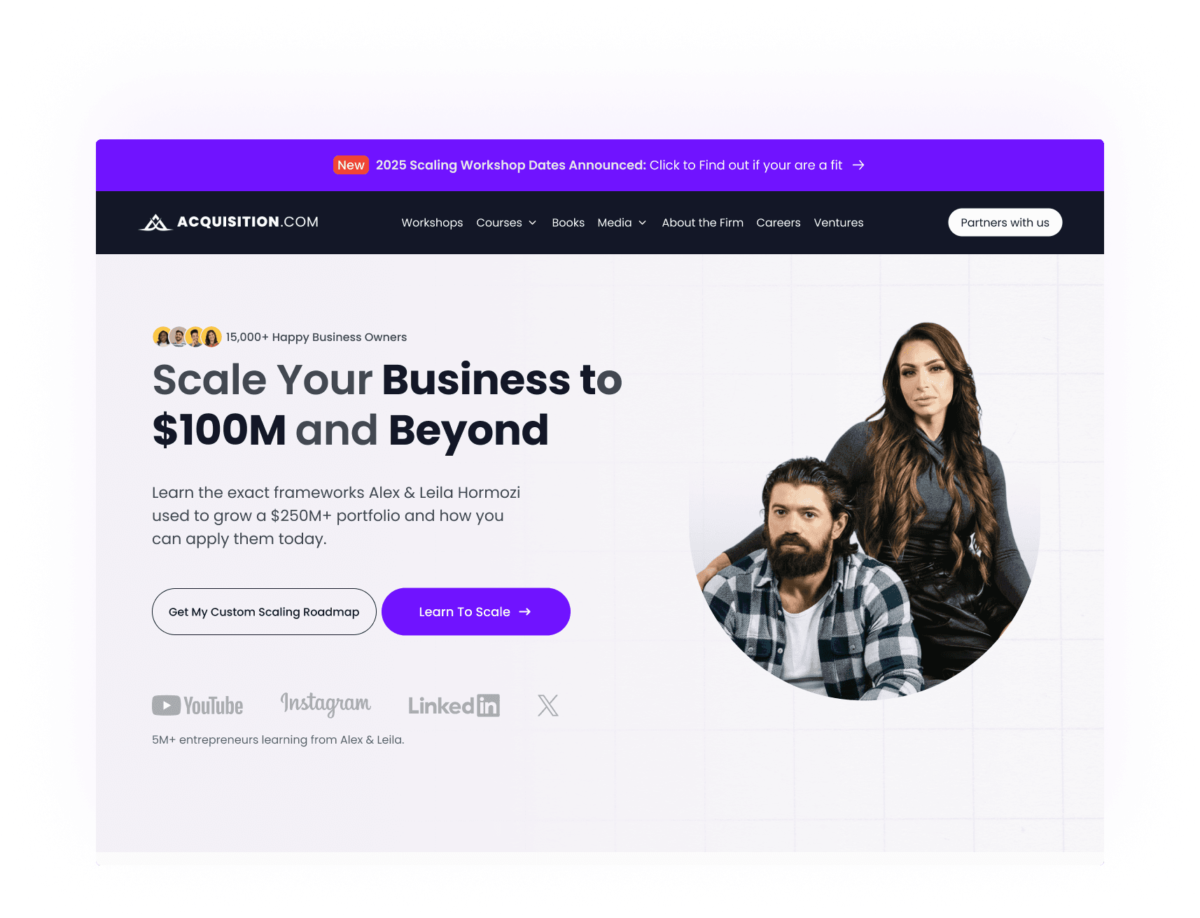
1. Hero Section
Added a stronger message:
“Scale your business to $100M and beyond.”
Two clear actions Watch the Roadmap and Learn to Scale.
Also added social proof: 15,000+ founders helped and featured on
YouTube, Instagram, LinkedIn, X, and TikTok.
2. Navigation
The old nav hid the main value.
Now, “Courses,” “Books,” and “Workshops” are front and center.
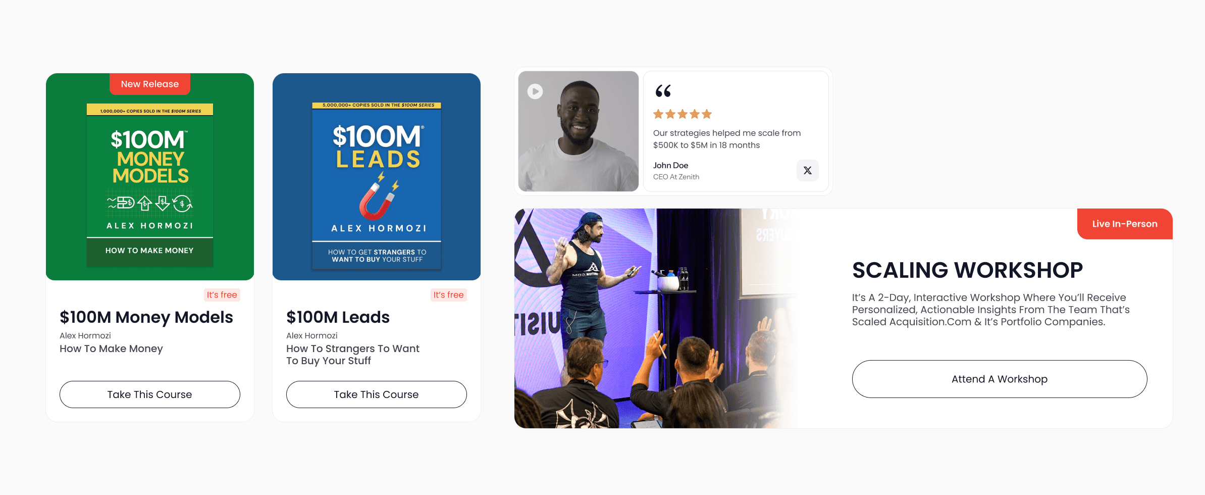
3. Visual System
Clean spacing, calm color palette, and more focus on people — not pixels.
Every button now has hover feedback small details, big trust.
4. Testimonials
Instead of text blocks, I used real founder faces and short quotes.
It feels human and credible not staged.
5. Footer
Rebuilt it to close strong.
Simple, dark, and confident.
Before / After
The old homepage felt like a pitch.
The new one feels like mentorship.
Before, users had to figure it out.
Now, they’re guided through it.
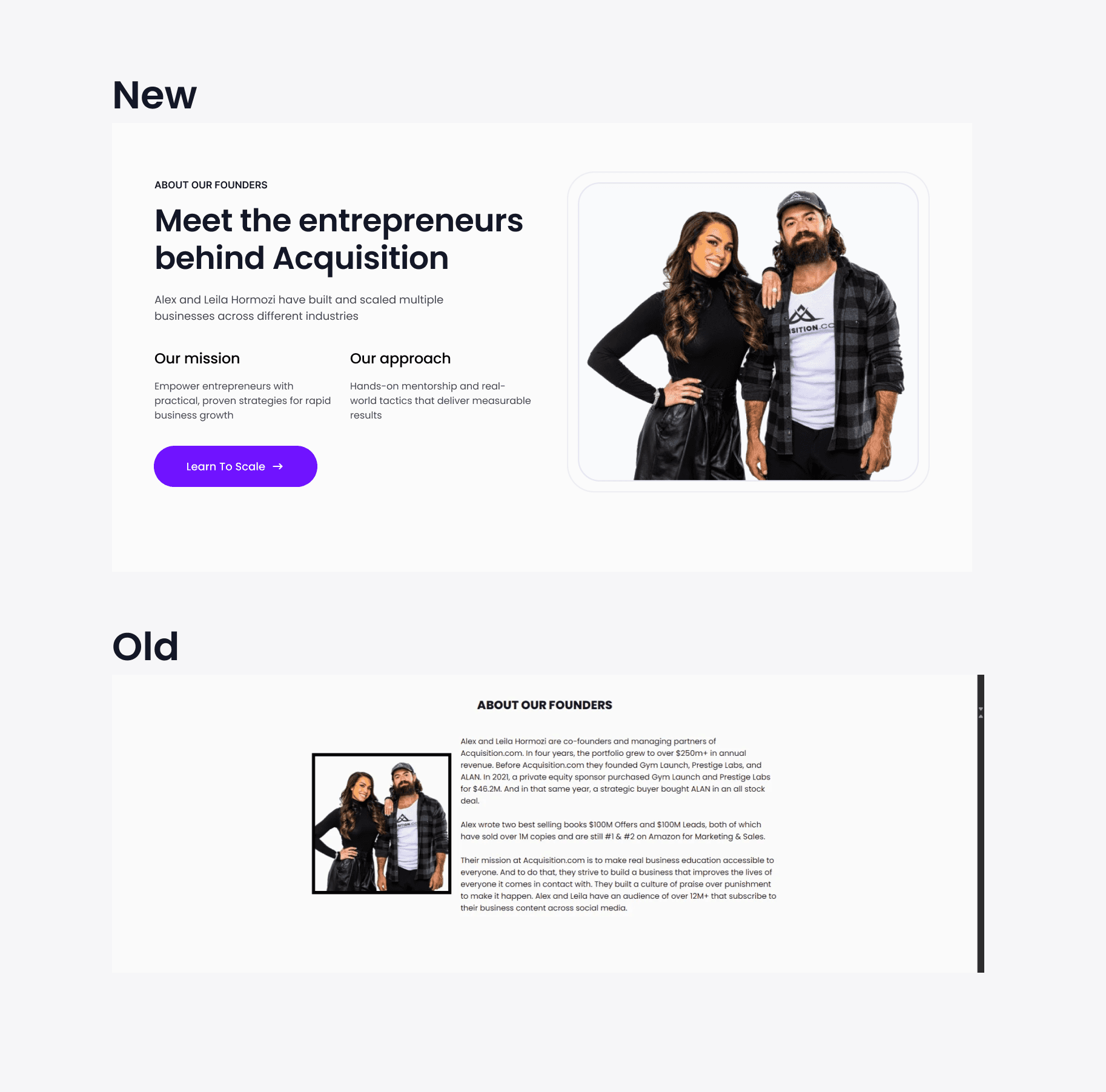
Founder section
From corporate to connection.
Results
Metric | Change |
|---|---|
Bounce Rate | ↓ 18% |
Avg. Session Time | ↑ 25% |
CTA Clicks | ↑ 40% |
Reflection
Even huge brands can lose trust if their design doesn’t match their authority.
This project reminded me that design isn’t about adding it’s about removing what confuses and highlighting what matters.
Now, Acquisition.com’s homepage feels like their brand:
clear, confident, and built to help people grow.


